26

A place to share and discuss data visualizations. #dataviz
(under new moderation as of 2024-01, please let me know if there are any changes you want to see!)
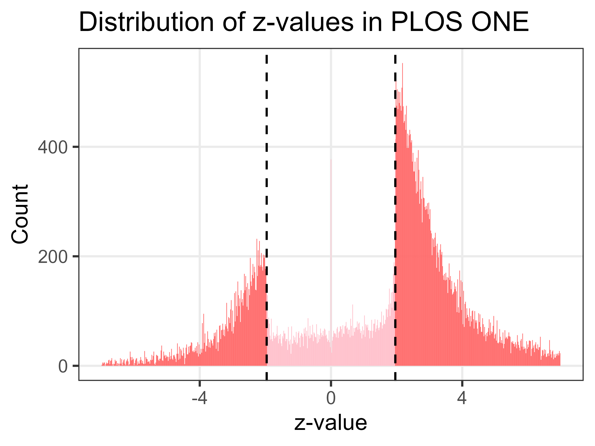
https://fivethirtyeight.com/features/science-isnt-broken/
Another study with the same goal of comparing the results from different research teams found similar disparities, though the graphs aren't quite as pretty.


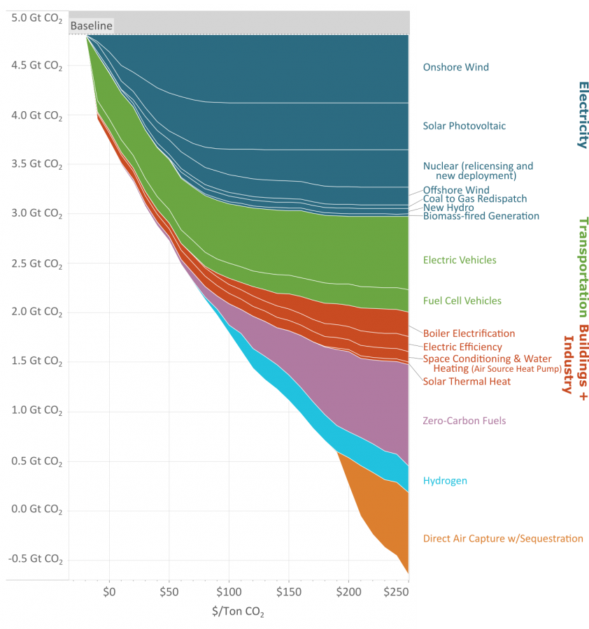
As you reduce the amount of carbon emissions (the y axis) the methods to keep reducing carbon cost more (the x axis.)
This great graph came to my attention from this video from vlogbrothers. It also has some good explanations of what it means.
Note that carbon capture doesn't really make sense till you've exhausted all the other emission minimizing methods.
Source: https://www.edf.org/revamped-cost-curve-reaching-net-zero-emissions
Apologies. This might not be the perfect community for the post.
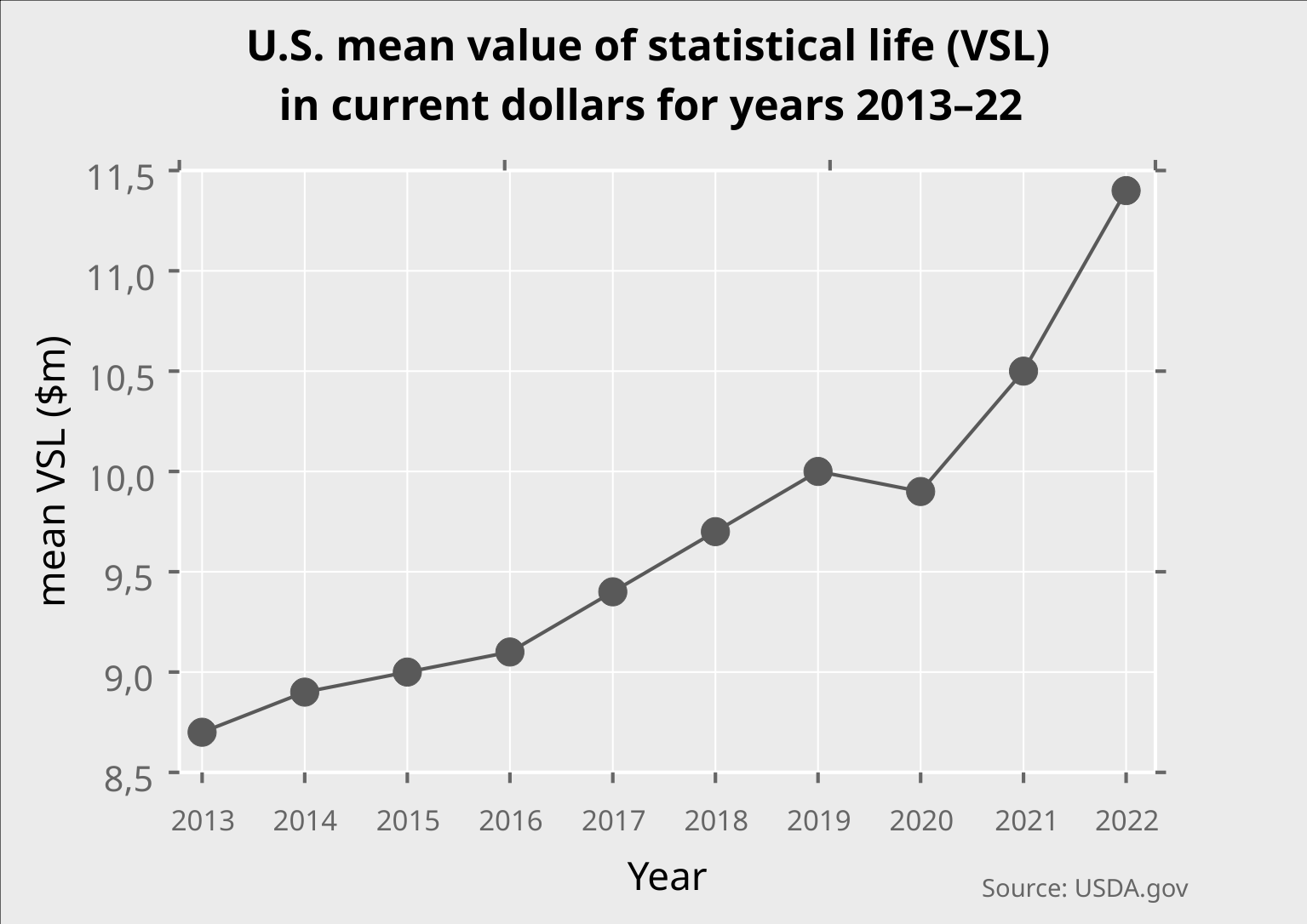
What's the value of statistical life (VSL)?
@dataisbeautiful
LabPlot ❤️ Data
➡️ https://en.wikipedia.org/wiki/Value_of_life
#DataAnalysis #DataScience #Data #DataViz #Visualization #Plotting #Statistics #Life #Risk #Safety #Security
#USA #USDA #FOSS #OpenSource #FLOSS #VSL
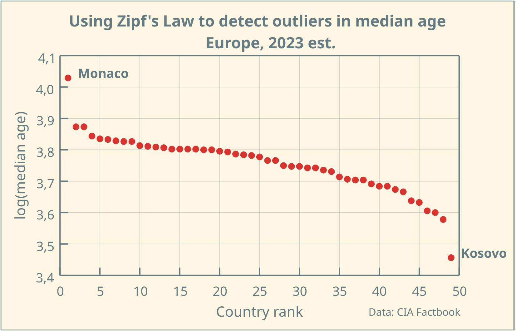
Using Zipf's Law to detect outliers in median age of European Countries in #LabPlot (2023 est.)
LabPlot ❤️ Data
➡️ https://en.wikipedia.org/wiki/Zipf%27s_law
#DataAnalysis #DataScience #Data #DataViz #Visualization #Plotting #Statistics #Age #Europe #FOSS #OpenSource

Source:
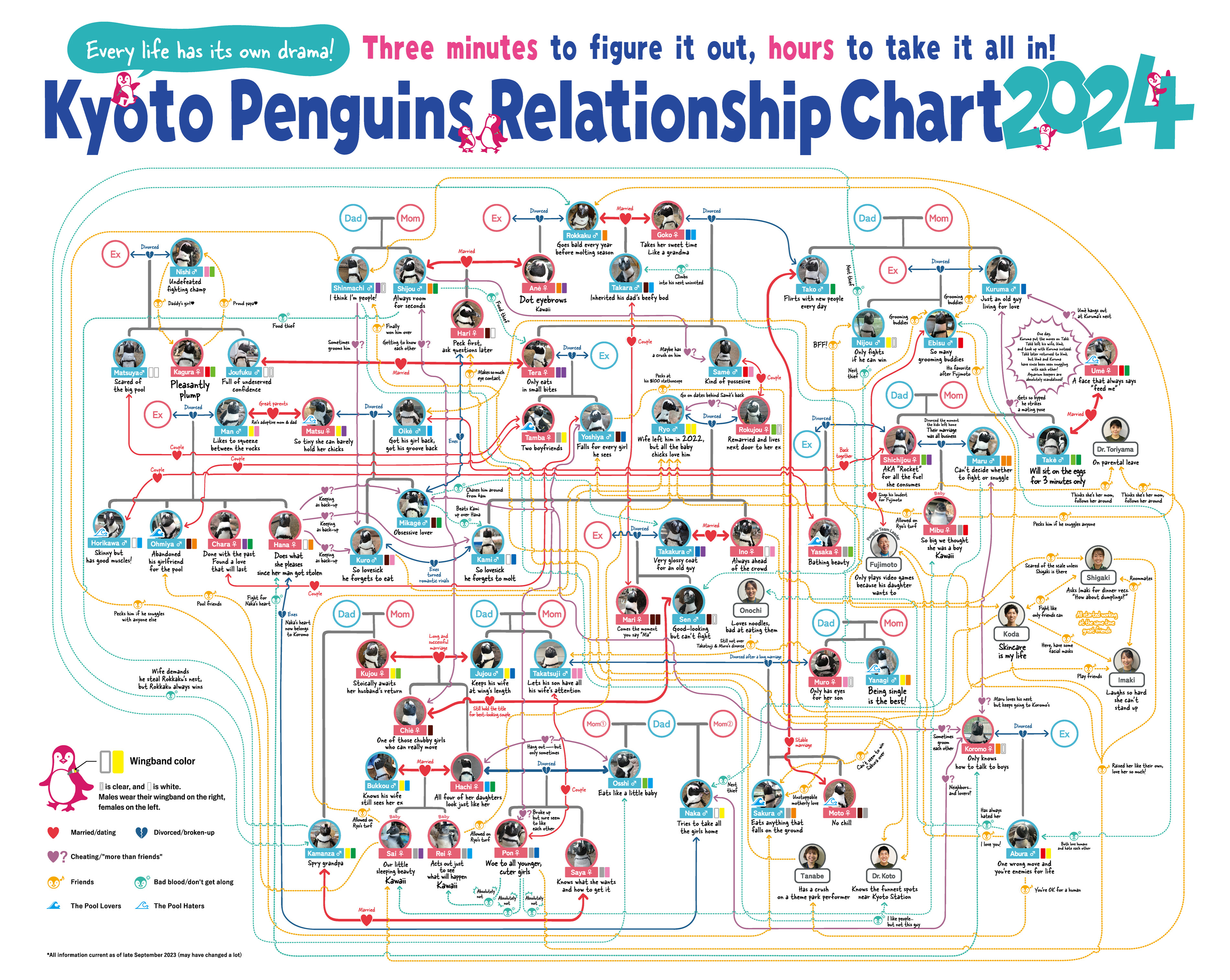
Another chart from Kyoto Aquarium
Source:
Seen on: Spoon & Tamago
Penguins, the way they waddle around and protect their eggs, are often thought of as cute, cuddly and romantic. But those who observe them for extended periods know they have a dark side. Two aquariums in Japan, Kyoto Aquarium and Sumida Aquarium, keep obsessive tabs on their penguins and maintain an updated flowchart that visualizes all their penguin drama.
Penguins are highly social species. They like being with others and, like humans, this can often lead to polyamorous and sometimes scandalous situations. Penguin drama can include serious crushes and heartbreaks but also adultery and egg-stealing. Penguins may even develop crushes on their caretakers. And these Japanese aquariums have it all charted in a flowchart that can be studied for hours.
EDIT: Thanks to @[email protected] for pointing out the english versions.