LabPlot

joined 2 years ago
[โ€“] [email protected] 2 points 1 month ago* (last edited 1 month ago)

@dataisbeautiful

Thank you for all your comments. A jittering of data points along the x-axis was used to avoid over-plotting. But yes, a scatter plot with a boxplot attached along the y-axis (to show outliers) may be more informative in this case.

[โ€“] [email protected] -5 points 1 month ago* (last edited 1 month ago) (2 children)

@clutchtwopointzero

A boxplot is a 1-dimensional plot. The data points are jittered along the x-axis to make them less crowded.

More on boxplots here:

โžก๏ธ https://labplot.kde.org/2021/08/11/box-plot/
โžก๏ธ https://userbase.kde.org/LabPlot/2DPlotting/BoxPlot


โ–ถ๏ธ Total olympic medals won in Paris 2024 and Human Development Index ๐Ÿ…

@dataisbeautiful

โžก๏ธ https://www.businesstimes.com.sg/opinion-features/what-olympic-medal-table-really-tells-us

After reading the article we made this #boxplot using #LabPlot, an open source data analysis and visualization software.

The plot doesn't provide answers, it rather invites some thinking.

#Olympics #Olympics2024 #France #China #USA #UnitedStates #UnitedKingdom #UK #Brazil #Australia #Japan #Italy #Canada #Germany #Italy #Netherlands #DataAnalysis #DataScience #OpenSource #FOSS
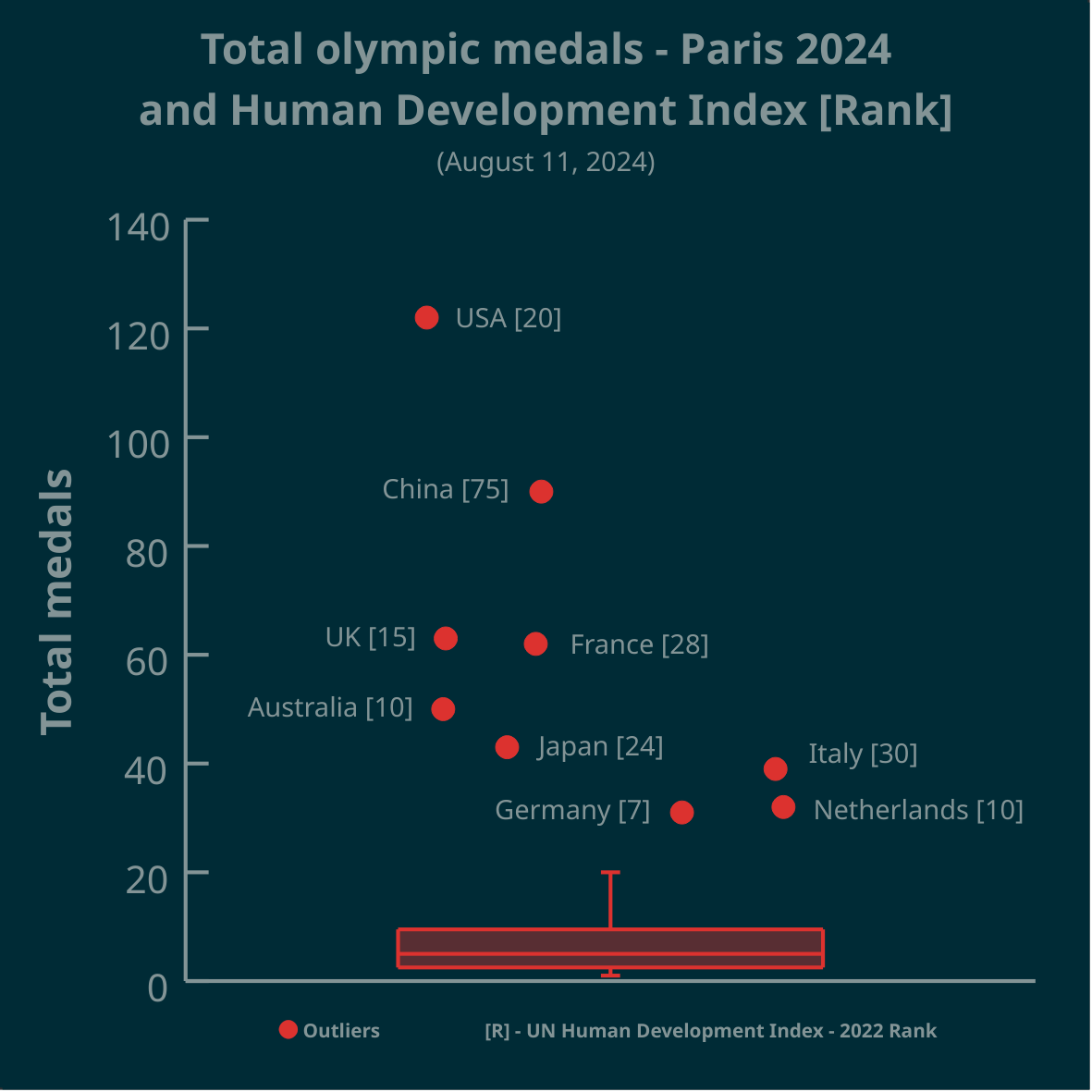
[โ€“] [email protected] 3 points 1 month ago

@architectonas

We used #LabPlot, a free, open source and cross-platform data visualization and analysis software.

LabPlot's homepage:
โžก๏ธ https://labplot.kde.org/

Video tutorials:
โžก๏ธ https://www.youtube.com/@LabPlot/videos

[โ€“] [email protected] 0 points 1 month ago (1 children)

@Eheran

Great question! And what's _your_ answer?

[โ€“] [email protected] 2 points 1 month ago* (last edited 1 month ago)

@Sconrad122

Any exploratory plot forms a question and your comment shows how to look for answers. Thanks!

[โ€“] [email protected] 1 points 1 month ago* (last edited 1 month ago)
[โ€“] [email protected] 0 points 1 month ago (1 children)

@smeg

The points are jittered along the x-axis, otherwise the data points could overlap.

[โ€“] [email protected] 1 points 1 month ago* (last edited 1 month ago) (1 children)

@NOT_RICK

Australia is the next country after Ethiopia, but it's not outlier in this case.

[โ€“] [email protected] 2 points 1 month ago* (last edited 1 month ago)
 

โ–ถ๏ธ Total olympic medals per 1k $GDP per capita - Paris 2024 - represented in the Tukey's boxplot ๐Ÿ…

@dataisbeautiful

Is the highest number, relative to $GDP per capita, best? Outliers marked as circles. Made in #LabPlot, an open-source data analysis and visualization software.

Edit: the problem is framed as a question.

#Olympics #Olympics2024 #France #China #NorthKorea #USA #UnitedStates #UnitedKingdom #UK #Brazil #Australia #Japan #Italy #Canada #Germany #Spain #DataAnalysis #DataViz

[โ€“] [email protected] 12 points 8 months ago (1 children)

@nikoof

Our Christmas tree includes a test to check if our readers are humans ๐Ÿ˜‰

[โ€“] [email protected] 21 points 8 months ago (1 children)

@zkfcfbzr @opensource

Let's just assume that the Christmas tree includes a test to check if our readers are humans ๐Ÿ™‚


Merry Christmas from the LabPlot team! ๐ŸŽ… ๐ŸŽ„

@opensource @kde
#Christmas #FOSS #FLOSS #OpenSource #KDE #LabPlot #DataScience #DataViz

18
submitted 8 months ago* (last edited 8 months ago) by [email protected] to c/[email protected]
 

Using Zipf's Law to detect outliers in median age of European Countries in #LabPlot (2023 est.)

@dataisbeautiful

LabPlot โค๏ธ Data

โžก๏ธ https://en.wikipedia.org/wiki/Zipf%27s_law

#DataAnalysis #DataScience #Data #DataViz #Visualization #Plotting #Statistics #Age #Europe #FOSS #OpenSource

[โ€“] [email protected] 1 points 10 months ago

@dataisbeautiful

The process average X and control limits are added to the plot for men. The average is 63.4. The upper control limit (UCL) is 64.8 and the lower control limit (LCL) is 62.0.

The UCL represents the largest value you would expect if you only have common causes of variation present. The LCL represents the smallest value you would expect if you only have common causes of variation present.

โžก๏ธ https://en.wikipedia.org/wiki/Control_chart

#DataViz #Statistics #Health #LabPlot #SPC #OpenSource

48
submitted 10 months ago* (last edited 10 months ago) by [email protected] to c/[email protected]
 

Is there a causal relationship between electricity consumption and obesity, or is it just an illusory correlationโ“

@science @dataisbeautiful @health

The plot and curve fitting made in @LabPlot, a FREE, open source Data Visualization and Analysis software. It works on #Windows, #Linux and #macOS.

โžก๏ธ https://labplot.kde.org/download

#Data compiled for 184 countries.

#FOSS #FLOSS #OpenSource #FreeSoftware #DataViz #Visualization #Obesity #Health #ClimateChange #ClimateCrisis #Climate #Food

view more: next โ€บ