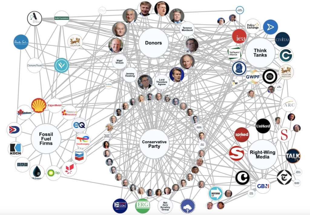
It's important information but not really a very beautiful or useful way of presenting it.
this post was submitted on 13 Jun 2024
30 points (89.5% liked)
Data Is Beautiful
6690 readers
10 users here now
A place to share and discuss data visualizations. #dataviz
(under new moderation as of 2024-01, please let me know if there are any changes you want to see!)
founded 3 years ago
MODERATORS
The lines coming from the label nodes add a lot of unnecessary visual noise. I think it's already pretty clear what's what based on the circles this graph is arranged into.
But how would you denote the individual relationships between certain ministers and certain papers for example.