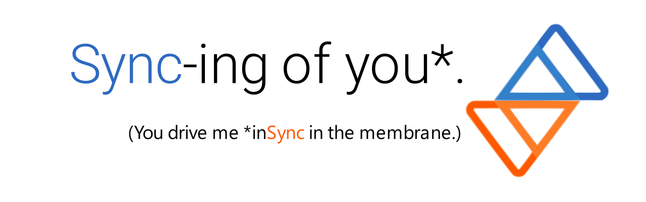
Hello everyone! Here is a list of banners that were designed & offered to the community by our valued member @[email protected]:


👀

Welcome to the official Sync for Lemmy community.
The rules for posting and commenting, besides the rules defined here for lemmy.world, are as follows:
1- No advertising or spam.
All types of advertising and spam are restricted in this community.
Artwork and community banner by: @[email protected]
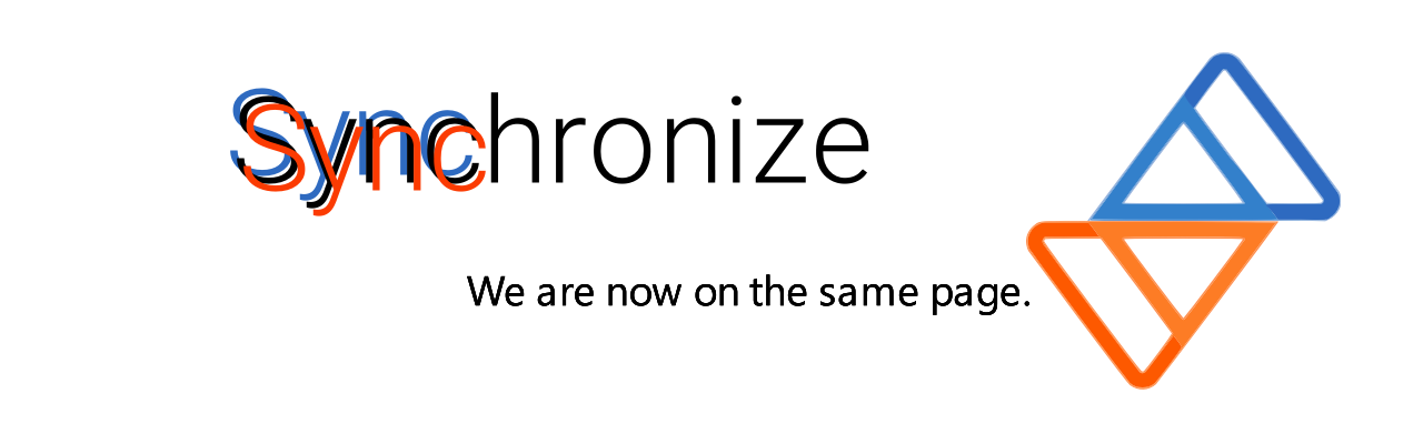
Hello everyone! Here is a list of banners that were designed & offered to the community by our valued member @[email protected]:
None of these appeal to me. I'd rather just have the big text say "Sync for Lemmy" and no small text.
#5 is the best! Don't be [removed]
Sync in Park
Oh, here we go for the hundredth time...
It starts with
one sync
The last two are my favorite
These are some banner ideas I came up with for brainstorming purposes. If you don't like them, then they won't be used. But hopefully they got a chuckle out of you. (Maybe)
Will take suggestions for current banner too (size, position, etc.).
As for the blurriness/unevenness of the logo, it's the best I can do with what I have right now, and having the original vector icon file will be very helpful.
I loved you in that movie you got naked in
You mean "2 Old 4 Leo"? That was fun.
Jeeez I didn't know there was a graphic artist strike too!
Jk this is fun stuff
3 is my favourite but none of them flaw me.
3 is like the least bad. Are these the official suggestions? Why even have 2 taglines? I'd most definitely erase the tiny bottom line.
They are not official.
Lmao they all made me chuckle.
Maybe Dont be [removed] is my favorite tho.
How in the world isn't there one about saying "Bye, Bye, Bye" to Reddit by getting N*Sync with Lemmy or something such? :P
That first one could also probably be spun into an nsync reference lol
Sync is everything is my fav. But switch the colors between the main healing and the subtitle sync, so that the main one is red and the kitchen sync is blue.
Edit: maybe even say "Even the kitchen Sync."
Countdown to Sync for me. Representative of where we are now, waiting...
No need for the second line
Scroll everything
And the kitchen Sync