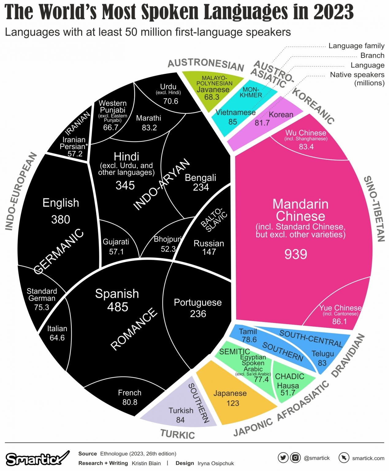
This is only showing native speakers so I feel like the title's a bit misleading
A place to share and discuss data visualizations. #dataviz
(under new moderation as of 2024-01, please let me know if there are any changes you want to see!)
This is only showing native speakers so I feel like the title's a bit misleading
it's saying first-language speakers
It only says that below the main title, and from the wording it's also unclear if that's what it's actually intended to show or just the cutoff for a language being represented.
Like, it could be interpreted as showing L1+L2 speakers of languages with >50m L1 speakers
I think that one should always read the subtitles anyway
Ok. I admit I missed the label in the top right saying "Native Speakers (millions)"
This community is off to a way better start compared to what was going on on r/dataisbeautiful by the time i left.
These graphics are great! Keep them coming.
Standard German, as opposed to the more exclusive Delux German. Use offer code "Schnauzbart" to save 15% on your next German subscription
So if a random person from anywhere in the world were to be teleported to my location, there's a 25% chance I would be able to understand them. ... And that chance would double if I learn Mandarin.
Only if they only spoke one language. Googling indicates there are somewhere around 1.45 to 2 billion total English speakers, so just knowing English might hit 25% already.
Edit: Also, the graph only lists languages with 50 million speakers, so the real proportions are smaller.
Probably more than thay since this takes into account only first-language speakers!
If you teleport to a random location there is a pretty good chance of sinking immediately into the ocean never to return so hope you speak fish? Following that are the inhospitable locations like deserts, deep in some forest or other, frozen mountains and other slightly slower routes to your eventual demise. Then all the places where you will be regarded as some sort of invader or trespasser.
Looks like about 70% is later and only about 10% of the remainder is inhabited so about 3% chance of landing somewhere with land and people.
http://www.curiousmeerkat.co.uk/questions/much-land-earth-inhabited/
What kind of graph is this? Can I make it with matplotlib?
Looks like a voronoi treemap
I get Japanese being its own little chunk due to their isolationist views for so long. But Turkish is surprising given how they were basically the gateway between Europe and Asia for so long.
The chunks are language families. Turkish is the only Turkic language which meets the cutoff; wikipedia says the second most spoken language in the family is Uzbek, but that only has 44 million speakers (native + second combined)
Well the Ottoman Turks didn't show up till around the 1400s so that is a bit later anyway... and they were Muslim so that kind of shutdown influence from the west for a bit.